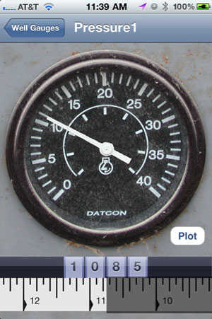
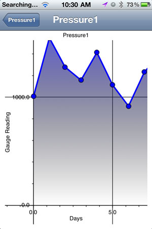
 Each one of the gauges has a plot button, like the one pictured on the right. A simple touch of the button will plot the data from that gauge. The data can be plotted in a variety of ways, and in this example it is plotted with the gauge value on the y-axis and days along the x-axis. Other presentations are possible, such as bar charts.
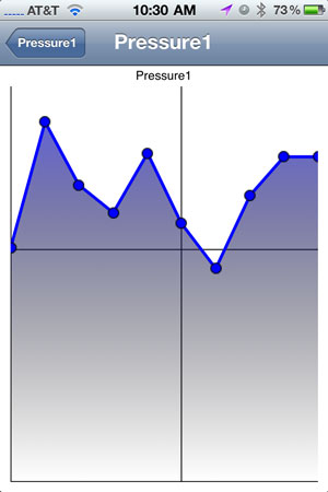
The first image on the right shows the plot as it is first presented. By using iPhone gestures, for scrolling and scaling, the plot can be moved and scaled. The second plot shows how the plot has been moved to show more of the x and y axis.
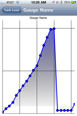
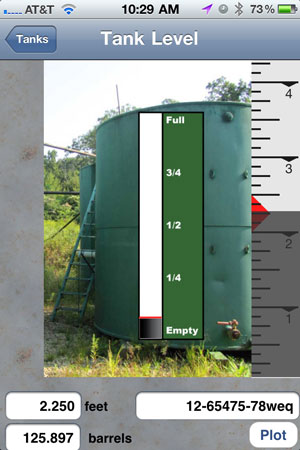 This next example shows the plot of tank as it is filled day-to-day. You can see the level rise, and then suddenly fall, indicating that the tank has been emptied.
Having easy access to gauge and tank level information at the wellsite can be a huge advantage for pumpers’.

Recent Comments